Unveiling Our New Identity: A Fresh Look that Reflects Our Mission
Unlike the old logo, it works well in monotone, and both horizontal and vertical formats.
Our new logo: A symbol of individuality and strength through diversity
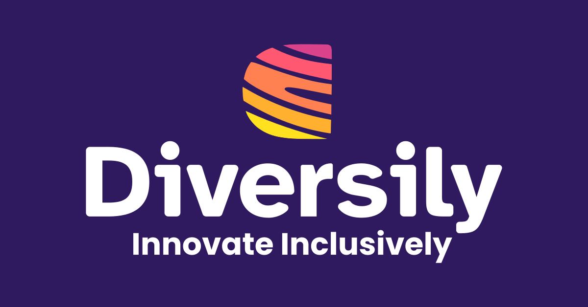
At the heart of our rebrand is our new logo, a visual representation of our commitment to celebrating individuality and embracing diversity. Our logo features a unique mark composed of ripples resembling a fingerprint. This symbolizes the distinctive nature of each person – a reminder that every individual brings something special to the table and that we are stronger together. The mark is housed in a backwards D that mirrors the D in Diversily. This represents the idea that it is OK to be different.
A new colour palette
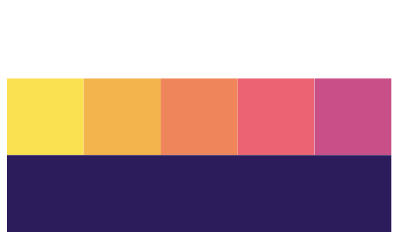
A simplified and accessible approach
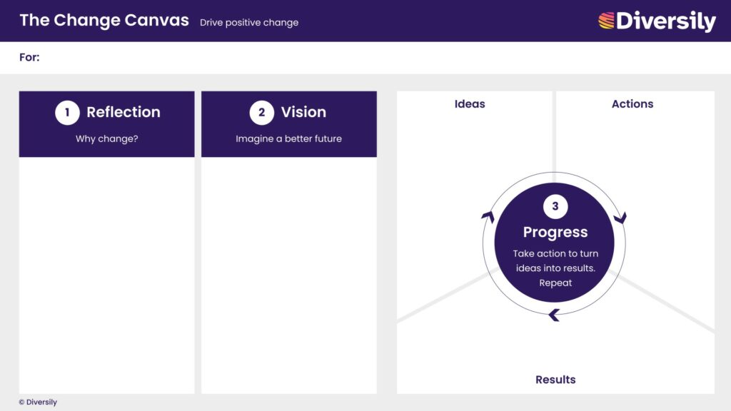
A fresh look for The Change Canvas
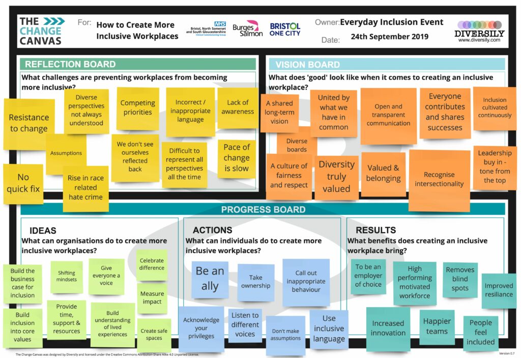
To make our visual identity even more user-friendly, we’ve updated all our visual frameworks. Understanding the importance of inclusivity, we’ve ensured that our visual frameworks are not only visually appealing but accessible, with high contrast between text and background.
The old Change Canvas design will live on, in the thousands of Change Canvases that have already been completed, to drive forward positive change around the world.
Our Mission: Inspiring Inclusive Innovation & Better Business
Our rebrand is not just about aesthetics; it’s a reflection of our mission. We firmly believe that businesses should have a positive impact on the world. This means being representative of the communities they serve, empowering everyone to thrive, and creating inclusive solutions that work for more people, more of the time.
Our mission is to inspire inclusive innovation and better business practices. We’re here to support innovative businesses in becoming more purpose-led and human-centered. By unlocking the collective brilliance of their people, embedding inclusive practices, and creating customer experiences that embrace diversity, we strive to make a real and positive difference in the world.
Final thoughts
As a small impact organisation, there is always more that can be done, no budget and no time. Given this context, we’re beyond excited about this rebrand and the positive impact it represents.
Our commitment to diversity, inclusion, and positive change is now more visible than ever. Thanks to everyone who has been a part of our journey so far. We can’t wait to continue making strides toward a more inclusive and innovative future together.

